case study2026
WhyClub
A streetwear label from India that sells oversized graphic tees in small drops. I built all of it, end to end. The brand, the product design, the storefront, and the backend that runs every order.
- Role
- Designer and builder
- Scope
- brand identity, art direction, UX and interaction design, design system, frontend, backend, webgl
- Live
- whyclub.in
-
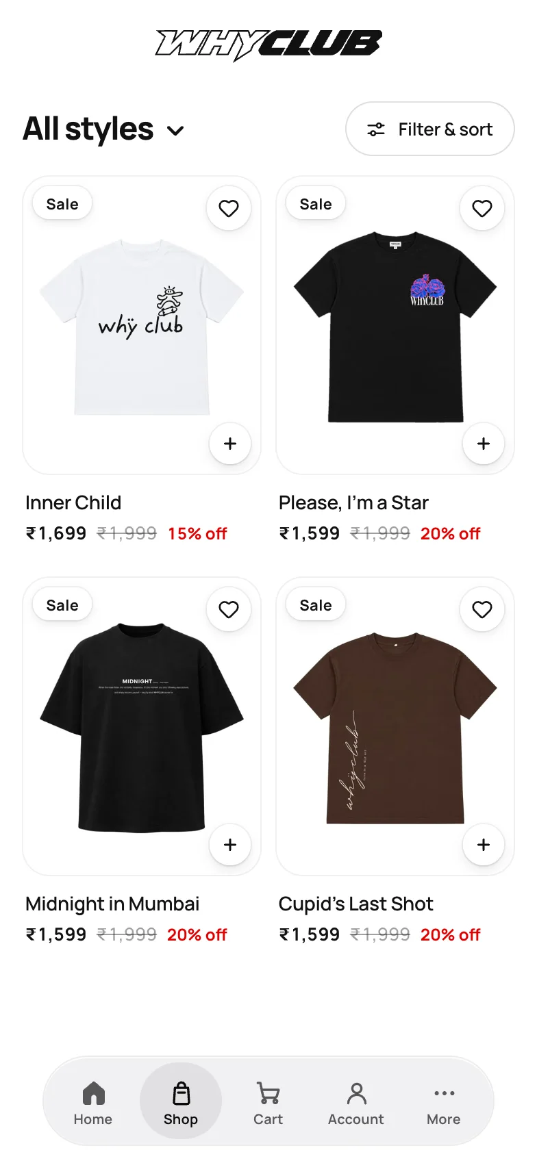
ShopTwo to a row. The + on each card is quick add.
-
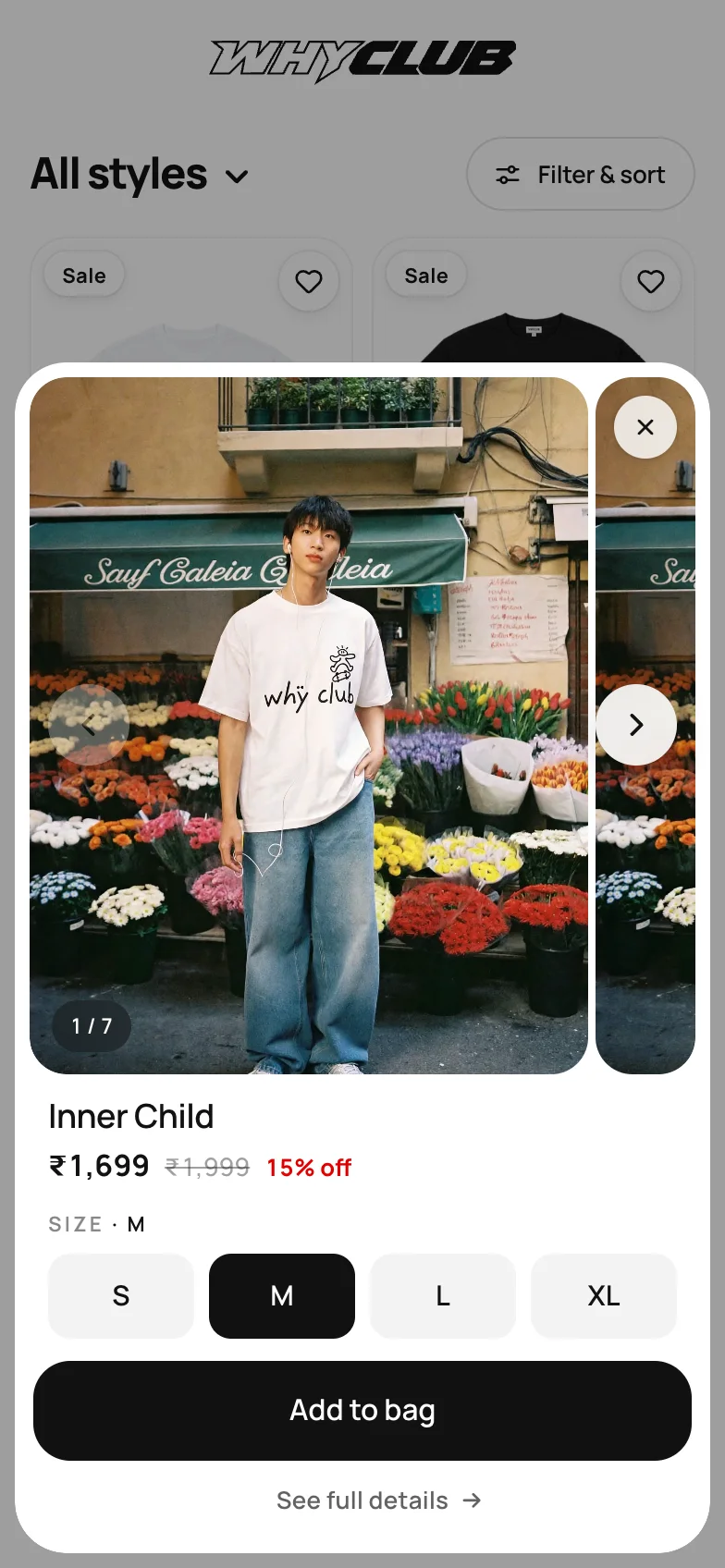
Quick addPhotos, price and size, without leaving the shop.
-
HomeOne drop per screen. Swipe for the next.
-
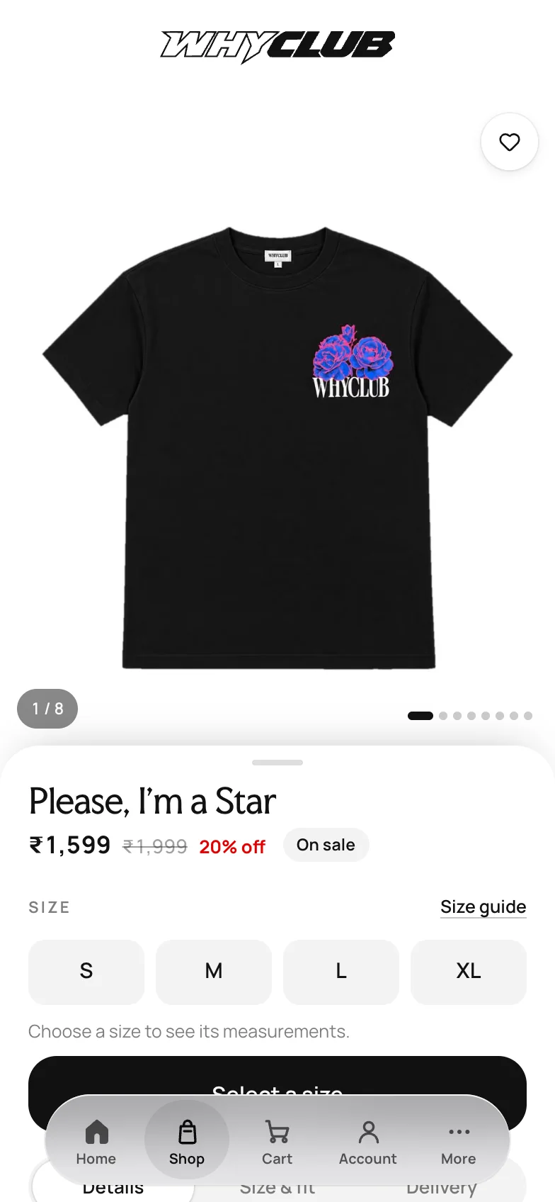
ProductPick a size, or open the size guide.
-
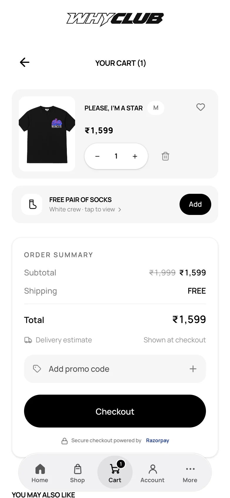
BagA free pair of socks, one tap to add.
A loud brand on a quiet store.
The drops are loud. Everything you shop from sits on plain neutrals.
-
The details rise over the tee
On a product page the details come up as a sheet over the photo, so the tee stays on screen while you read.
-
Every drop gets the whole screen
A campaign photo per drop, with the tee’s name across it.
-
The bag, kept short
Each piece on one line, the total under it, then checkout.


The idea
Most shops are built by a lot of people. One person does the brand, another designs the store, someone else builds it, and someone else again wires up the orders. Every handover loses a little: a font gets swapped, an animation gets cut, a button stops feeling right.
I did all of it myself, so nothing got lost in between. WhyClub is a streetwear label, and I made every part of it: how it looks, how the store feels in your hand, and the system that takes an order from paid to delivered.
01The dock
One piece of navigation that changes shape.
Pill60 × 56
Further down the page.
Bar328 × 64
At the top of the page.
Account360 × 288
Opened from its tab.
More360 × 288
Opened from its tab.
Clothes get bought on phones, so navigation lives where your thumb already is: a dock at the bottom of the screen. It's one surface with three shapes. At the top of a page it's a bar of five. Scroll and it shrinks to a pill that slides left, out of the way of the buy button. Tap Shop, Account or More and the bar grows into a panel, with a Back at the top to fold it up again.
The shell is the only part that changes size. It moves on spring curves written as CSS linear() easings, so a tap halfway through a transition picks up from wherever the dock is instead of snapping back. Everything inside it only fades and moves. It has its own quiet sounds too: a soft tick for a tap, and a short breath when a panel opens and closes.
The idea of a row that becomes the menu, instead of opening one, comes from Danny Williams’ “A dock that unfolds”. I built WhyClub’s version around a store: panels with campaign photos, a pill that makes room to buy, and a real page behind every row.
The idea of a row that becomes the menu, instead of opening one, comes from Danny Williams’ “A dock that unfolds”. I built WhyClub’s version around a store: panels with campaign photos, a pill that makes room to buy, and a real page behind every row.
02After you order
Every order gets a pass that changes as it ships.
Ordering is usually where a store goes quiet: a confirmation email and a tracking link. I wanted it to be the part people remember.
It prints in when you pay, then moves through You're in, All packed, On its way and It's home. Each stage has its own scene drawn live in WebGL: a bloom opening, a box getting taped, a route drawing itself to a pin.
The same hand-written shaders turn up around the store: riso-style badges for the beta pass, a dithered asterisk, and a 404 page where a prism splits the light.
You’re in.
Payment’s in and your pieces are set aside for you.
03Behind the counter
I built the half you don't see too.
The backend takes the order, keeps the pass in step with the parcel, and gives me the tools I need to put out each release.
Doing both halves meant the details survived. The sheet over the photo, the dock that opens into a menu, the pass that changes when your parcel ships: none of it had to be explained to anyone first. I just built it. I genuinely believe that's the biggest advantage of one person working across design and engineering.
Details
The parts nobody asks for.
Most of the work was in things people only notice when they’re missing. A few of them, up close.


Detail 1 of 4
Safari takes the photo’s colour
On iOS 26 Safari’s bars are glass, and they tint from the page. At first the top of the home page showed a white strip and the bottom toolbar sat on white, so the hero photo looked like it had been pasted in.
Now each hero photo’s top edge is sampled once and handed to the browser as the colour to tint from, after the carousel settles so a swipe never waits on it.
iOS 26 changed how Safari sits around a page, and I wanted the store to feel like it belonged on an iPhone. The approach comes from Josh Puckett’s write-up on seamless mobile Safari, and the credit belongs there.
- Sampled
- once per photo, then reused
- Safari
- tints from the page background
- Android Chrome
- tints its URL bar from the theme colour
Detail 2 of 4
Waiting looks like where you’re going
Tap a link and WhyClub works out what kind of page you asked for from its address: the shop, a product, a policy, your account. If it isn’t ready in 350ms, a wireframe of that page fades in, with the product’s name already there if you tapped a card.
The wireframe is drawn in the page’s own layout, so the real photos have somewhere to land. If a page hangs for ten seconds, the browser’s own load takes over instead of leaving you on a stuck screen.
- Wireframe after
- 350ms
- Fade in
- 120ms
- Gives up after
- 10 seconds
- Page kinds
- home, shop, product, policy, contact, story, account, track order, other
Detail 3 of 4
The entrance
The first visit opens on black with the wordmark, then the hero comes up behind it. It plays once per visit, never on every page.
It waits for the hero image to decode before it opens, and a safety timer clears it after 8 seconds either way, so a slow connection never leaves you behind black.
- Opening
- 1.55 seconds
- Plays
- once per browser session
- Clears itself after
- 8 seconds at most
- Number 10px, #777, slides 6px in over 180ms
- Label steps 1.35rem over 260ms
- The rest fall back to #666
Detail 4 of 4
A footer with an index
Every link in the footer carries a running number across all three columns. Point at one and its number slides in, the label steps right and everything else steps back. It’s the kind of thing you find by accident.
Try it below. This is the same CSS. On a phone, tap a link.


How it’s built
The pass, and the shaders around it
The print
When Razorpay confirms a payment, the bag gives way to a printer slot and the pass feeds out of it. The print is one speed curve, a nudge, a breath, three ticks and a glide, handed to the browser as a single linear() easing, so the paper never jumps between steps.
One shader, four scenes
The colour band at the top is one fragment shader, written by hand in WebGL, that draws a different scene for each stage. It’s live light, not a video. It pauses when it’s off screen and draws a single still frame for reduced motion.
What moves it
Courier updates from Shiprocket and payments from Razorpay arrive by webhook, and each one moves the order to its next stage. The pass only says what has happened: the progress fill ends at the stop your order is on, never ahead of it, and eases on to the next one instead of jumping.
The rest of the card
Up next is written in the future tense, so the pass never says packed before it is. With nothing left to come, it says Complete. The barcode is just for looks: it’s drawn from the pass number, so every pass gets its own.
Around the store
The same hand-written shaders turn up elsewhere: riso-style badges for the beta pass, a dithered asterisk, and a 404 page where a prism splits the light.
- Stages
- Confirmed, Packed, Shipped, Delivered
- Drawn with
- one WebGL fragment shader
- 1.7 seconds, one linear() curve
- Off screen
- paused
- Reduced motion
- a single still frame
- Moved by
- Razorpay and Shiprocket webhooks
Process
How it got made.
Real tees, generated models
The tees are real. The people wearing them aren’t. Each photo starts from the actual tee, swapped onto a generated model, then the same model turns around for the back. The store says so in its footer and its terms.
Claude sorted the finished photos onto the four tees and encoded them with ffmpeg. One batch went from 356 MB of PNGs to 5.3 MB of AVIF.
-
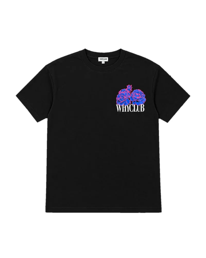
01The tee
-
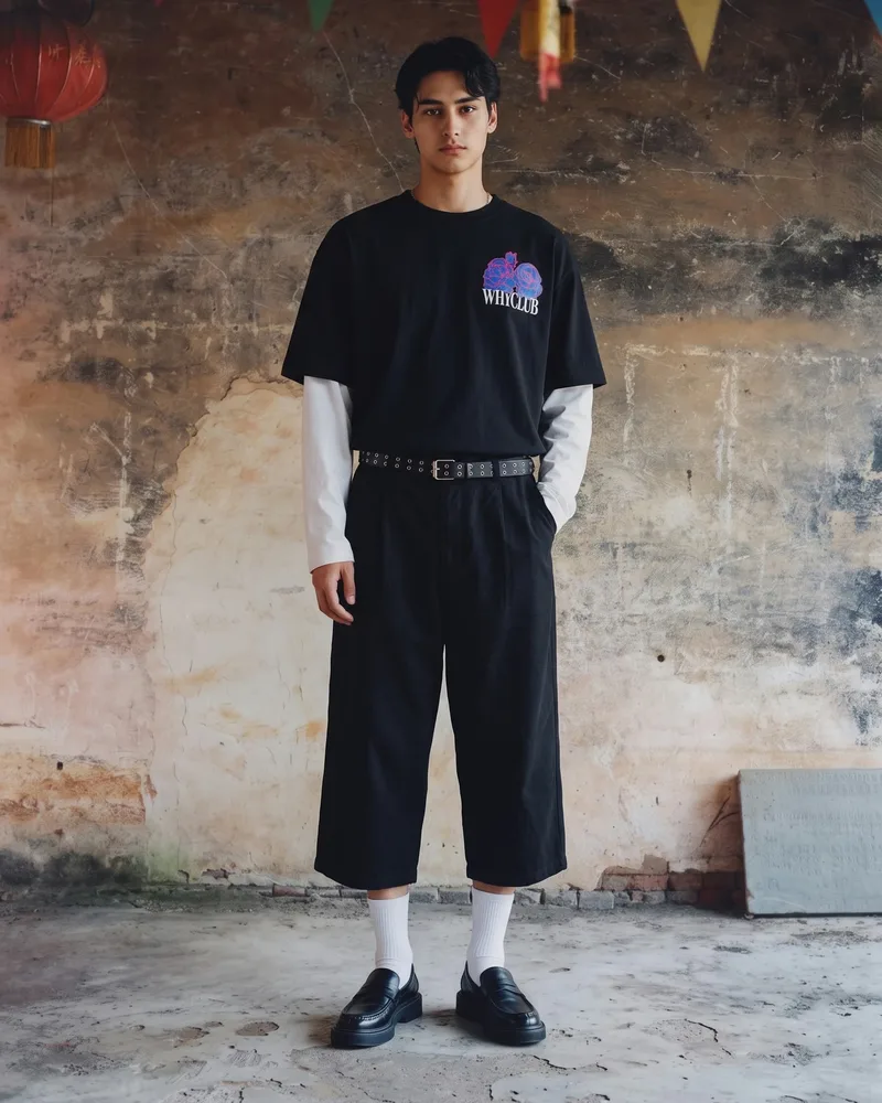
02On a generated model
-
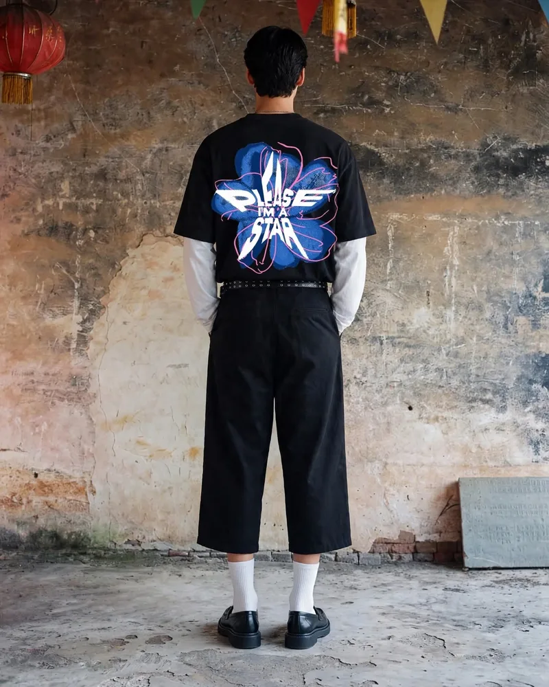
03Turned around


Built in a loop
I built the store with Claude, in short loops like this one. Since late September 2026 that’s 98 sessions and 426 prompts.
- 01A referenceA link, a screen recording or a pin, pasted in with what I want from it.
- 02Versions side by sideClaude builds three to five versions behind a switcher. I pick one and the rest go.
- 03Notes on the pageI click an element on the running store and write the note right there, so feedback points at the exact thing.
- 04On a real phoneThe iOS Simulator first, then my iPhone. A push to main is the deploy, so nothing ships before that.
What it runs on
- Storefront
- Astro on Cloudflare Workers, React islands, Tailwind
- Orders and sign-in
- Convex
- Payments
- Razorpay, cash on delivery included
- Shipping and email
- Shiprocket, Resend
- Motion and sound
- GSAP, Framer Motion, WebGL shaders, Web Audio